Wednesday, September 28, 2011

The suspended ---- Claire Morgan

It is strange that human beings have always been fond of things in the air, or being able to be in the air, moving or still. Artists very frequently make art work with suspended objects. The dreamy and airy fascination is a great beauty to our eyes. You can find this kind of satisfaction in British artist Claire Morgan's works.
This work is called 'A Part at the Seam'. To me, the first thing that attracts my eyes is the perfect geometric form created by thousands of very airy looking white thistle seeds suspended in the air, so dreamy and romantic. This is like her signature way of making an art piece: Suspending thousands of little individuals to form different geometric forms.
Look closer, a taxidermy jackdaw was placed on what seems to be a rectangular plane made of torn black plastic bags. Animal in a fairy land? Unlike some of her other works, this one to me is more peaceful and light, it shows a vivid scene of a living jackdaw, maybe a scene about the beauty of the nature.
Then we have this one, called Fluid, showing a crow being hurt, her body heavily hitting to the ground, the falling speed is fast and intense, she is experiencing the process of death.
The color of the fresh strawberries represents blood. The weight of the numerous strawberries adds the heavy feeling people get from the falling and dying scene.
The artist probably wants to show her strong connection with the nature, the animals, the connection between their life and her (or human beings') life.
Over time, the strawberries decay, and fall off from the lead, mold grows on them, right next to the crow's still wing. It's a much sadder story told than the first one I showed.
The last one I have to show you is this very clean lined, perfectly designed geometric form made of one of the most disgusting creatures: FLIES. The name of the work is "Architecture". I like the art, but I don't like the flies!

Monday, September 26, 2011

Only her body ---- Kong Lingnan

I don't know since when the neon effect started to appearing in art and dance. Last year in America's got talent, a dance group called Fighting Gravity used neon effect in their dance, and this year another dance group Team Illuminate did the silimar thing, they wore some sort of reflecting material, outlining their body with the shapes they wanted, and then danced in a completely dark stage, so people can only see the movements of the neon shapes as they dance around. It is so magical, almost like a fantasy.

Then I found the same concept used in art by a female Chinese artist Kong Lingnan, the effect looks exact the same as in the dance.
She named the exibition "Only her body", and here is her explanation for the title: 'Only Her Body doesn’t refer to the feminine body—it projects the world, the universe, the feminine aura. I think we only see the world we want to see, so we build up all kinds of systems to fit our perception. I ask myself: What is the real face of the world? There shouldn’t be [only] kind and evil, or beauty and ugliness—just the world itself.'

Seeing the work, I personally don't get either the title or her explanation. The work seems to solely use neon to tell a story, a story of people working or camping north or south poles in the mountains covered with snow.
The clean lines created by the neon lights surely fits people's imagination of the romote, isolated space and mountiains of the north poles; The dark background adds loneliness and maybe a little mystery to our imagination.
To me, she did simply depict the beauty of the world, not 'just the world itself'.
If she just wants to depict the world itself, I think maybe it's best to create different scenes with different location, time, and figures instead of telling what seems to me a coherent story.
It is amazing that she didn't really use neon lights as the media for this project, she just used normal oil paint, the contrast of the different colors created the neon effect. I have no idea how the whole thing works since I don't paint and know nothing about painting. To me, it is very creative to use oil paint this way, it's very new and modern. It kind of twists people's traditional aesthetic appreciation of painting and adds more fun.

Thursday, September 22, 2011

The beauty of devastation ---- Gerry Judah

I do not think the devastation itself is beautiful (maybe only in art)... I just think the art of devastation created by Gerry Judah is beautiful, the beauty in the ruins has a strong impact, making people think or even mourn.

"The Crusader" The sculpture comprises a 7 meter three-dimensional crucifix covered with a lattice of war-torn buildings lacquered in snow white.
Why did the artist use sole white color? When people think about war, destruction or disaster, they would think about fear, grief, insecurity, and Darkness. So why did not the artist use the color black? Wouldn't that be more convincing? I pictured an image with this piece in black in my head and immediately denied my questions. I think the artist simply wants people to see the devastation in a rational way without dwelling themselves too much in the sorrow brought from the war. And white is probably the best color to represent the artist's idea in this piece. Snow white makes people calm, with the feelings of sympathy, regret, or even anger brought from the war, the whole combination of feelings just make people think, think deeply about the causes, usually started by human beings, ourselves.

Another element the artist used that strikes me is the needle like sticks poking out from the ruin. They are like hundreds of spears dashing toward you, piercing through your thoughts and soul. Without this element, the piece would lose a lot of power.

As a Christian, it is ironic to see a war ruin built on the cross. It seems to me that the artist just used an abstract way to proclaim the war between the US and Iraq since the US is considered as a Christian country, and the size of the crucifix shows the power the US has over the world. "In the name of Jesus Christ, we come to destroy your land, and we shall be glorified with your devastation", an ironic message I got from the artist.

We should be ashamed of ourselves for the things we have done to our world. We should think about it, meditate, and build more happiness toward others; other nations.
The artist also has paintings with similar theme done before the sculpture has created. I want to show you some pictures of the details to build more connection with the art.
He is also good at gigantic installation art, here are some pictures of his works made for some big car companies.

Wednesday, September 14, 2011

Ice men ---- Nele Azevedo

Some people call it Melting men. I prefer to call it Ice men because I am more fascinated by the beauty of the ice men than the depression of the melting process. Or perhaps I am equally fascinated by both, just don't want to think or feel too much about the powerlessness of the quiescent withering.

These 1000 ice men were created by Brazilian installation artist Nele Azevedo, displayed in Berlin for WWFN (World Wide Fund for Nature) to show opposition to global warming. They were placed seated on the stairs side by side in the hot summer sun, waiting to melt.
The moment they were just put out with their beautiful curvilinear shape and dreamily translucent body, displayed in front of people's eyes I would imagine nobody could keep from feeling the sweetness created by such a large group of little cute figurines. At first, everything was happy. As time goes by, the summer heat increases; little humans started to melt until the last one disappears. The whole scene only lasted about half an hour. While people were watching, they were experiencing the feeling of despair and powerlessness; standing in the sun light, they too felt the strong heat.
This art piece smartly served it's purpose, invoking people to think, not just about the art itself, but also about themselves, their own lives, and how it will be affected by the increasing global warming phenomenon.
The artist has done some other installation works. But I don't find they are as nearly as interesting as the Ice men. Here are a couple more works I found.
The exercise of inhabiting the emptiness, 80-by-10-cm iron sculpture
Landscape Poem, window art

Monday, September 12, 2011

Transformation of the unnoticed ---- Jessica Stockholder

I recently finished my very first 3D project for my art class assignment, and today I happened to discover this female installation artiest Jessica Stockholder, whose work somehow share some similarities with mine.

The two similarities are: color and material.

When you look at her work, the first thing that strikes you is the color, very bright and rich pink, blue, yellow, green and so on. Since color is one of my favorite things about art, I really appreciate the boldness in her using of different colors.


Here is a good example:
"Growing Rock Candy Mountain Grasses in Canned Sand; 1992; Installation view, Westfalischer Kunstverein, Munster, Germany; 23 x 12 m piece of violet bathing suit material, sandstone native to Munster, gaseous concrete building blocks, plaster, basket material, electrical wiring, 3 very small lights, newspaper glued to the wall, acrylic paint, metal cables and Styrofoam." [link]

Doesn't the massive pink color immidatelly draw your attention? Though it did not remind me of mountains, as I just saw lots of pointy waves going up and down with there rich pink color. However they are powerful and at the same time have the softness of femininity. They are also a little like (especially with the wrinkles of the material)... sculptures filled up with air; romantic waves.

The next thing special about her is the material she uses. I used a shower loofa, which can be easily found in every home, as the skin for my 3D project because I always have the habit of reusing things that would normally be considered as useless or garbage due to the fact that I really hate to wast things. I do not know if Jessica has the same idea as mine or she just simply wants to do something unexpected. She likes to use normal daily objects, like couch cushions, plastic container lids, shoe laces, fake fur, lamps, electrical cord, pillows, balls, etc. I think it's just marvelous to make something beautiful with everyday materials that are usually unnoticed, and if she can always use second-hand material, that would be even more astonishing.


This is a good example of reusing trash:
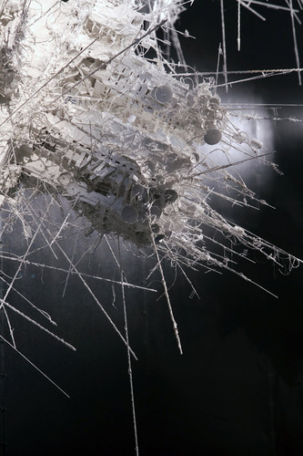
"Untitled, 2009, plastic tray, gray plastic, hardware, African wood, foam, cloth, styrofoam, ribbons, tape, 35x21x9 inches." [link]
Her work is usually very abstract with material that's usually very practical in daily life. Beauty or waste, pink or green, the strong contrast of her work simply says one fact: a true artist.


"Sweet for Three Oranges"
1995
Installation at Sala Montcada de la Fundacio la Caixa, Barcelona, Spain
Paint, approximately 40 Christmas trees, oranges, 4 bird cages, brick wall, air craft cable, butane heaters, rope, roofing paper and roofing tar, lightbulbs, yellow electric cord


"Skin Toned Garden Mapping"
1991
Installation at the Renaissance Society, Chicago, Illinois
Paint, red carpet, 2 x 4s, roofing tar, refrigerator doors, hardware, yellow bug lights and fixtures, cloth, vinyl composition floor tiles, concrete and tinfoil, 3140 square feet overall

Saturday, September 10, 2011

Photography with Chinese soul ---- Hu Jiaxing

I have seen a lot of back and white photography in the past, a lot them had touched me with their silently restrained strength and emotion. I love the unique power in the simplicity of black and white. The quiet expression always intrigues people and causes them to seek for more details.

The photography I want to talk about today is from a series called 灵山(La Montagne de l'âme in French, Ling Mountain in English) by Chinese artist Hu Jiaxing. The artist started practicing Chinese calligraphy from when he was ten, and I can see the influence very clearly in his works. I had very similar experience in my childhood since I grew up with a very strict family, I started practicing calligraphy since I was about 8. I practiced for two years under my parents' supervision. Familiar with the art and the process, I immediately sensed the connection between his black and white photos and traditional Chinese calligraphy.

Before showing you the photos I want to explain to you how the Chinese calligraphy process works. I remember when I was little, everyday before I start 'writing' with calligraphy brush I had to grind the Chinese ink on a grinding stone (砚台, also called ink stone in English) with a rectangular stone piece. The Chinese ink is very thick, so we usually add a little water as we grind it. We are supposed to do it slowly and firmly in one direction with a peaceful mind and pace. During the grinding process the ink and water slowly joining each other, mixing up harmoniously; the rich, strong and thick black color of the ink, occasionally reflecting the light...

This picture says it all, by the artist, unintentional or not. His love of traditional Chinese calligraphy influences his work, and would be clear to anyone familiar with the process.
And here is another one. Not as strong as the previous one, but the body of the tree still shows a trace. The next few show more about Chinese calligraphy itself (the dark black color and the movement of the strokes) then the texture and form of the ink.
If you wanna see more, here is the link of this series http://hujiaxing.com/projects/montagne-de-lame/

Thursday, September 1, 2011

Sunflower seeds -- Ai weiwei

I have never paid too much attention to any art work or artist. I was kind of stunned when I heard we all have to write blogs about various artists and their works. Since I don't really know how to 'read' an art piece, I decided to start with the culture I'm familiar with and the artists who are from the same culture background as I am. So here we go, I was reading the Twitter of one of the most influential Chinese artists, Ai weiwei, where I saw this picture of two sunflower seeds with the Chinese name and Pinyin in the background. Then I said to myself: Artists are indeed strange, two pieces of sunflower seeds?? Art?? What's the point? The two sunflower seeds I saw on twitter
Despite my despair, I kept on researching on google, where I saw some pictures with random people walking in a huge hall carpetted with some sort of gray material, like small rocks or sand. At first, I thought the idea "random people walking in a huge hall" might be the artists' intended disign of the art piece. Then I found more and more pictures of similar scene, those sandlike materials are NOT rocks or sand, they are tiny little sunflower seeds! One hundred million of them! All made out of porcelain! Every single one of them was handmade and painted in China in a Town called Jing de zhen (I've been there a few years ago). I was immediately impressed and fell in love with the whole concept! I love the idea; it's a vibrative scene consisting of countless tiny little individuls, every single individual is different and characterized. They look so real that people would put them in their mouth and test if they are really made out of porcelain. I also love the idea how everybody can just go ahead and take a walk on the sea of sunflower seeds, listening to the popping sound as you move your feet. It is an art piece you can see, you can feel, you can mingle yourself in and feel so strongly the sensitivity of the artist. Sunflower seeds ( Exhibition in Tate Modern, London), all seeds together weigh 150 tons and took more than 1600 workers to make
But what is the deeper message the artist wants to tell? During the culture revolution of China, Chairman Mao was represented as the sun, all the chinese people were represented as sunflowers, as sunflowers always face the sun. I think in this art piece, Ai weiwei used numerous sunflower seeds standing for millions of chinese citizens, from a distance, they look like sand, inconspicuous and not important. But when you pick them up, examine them one by one, you can see that every single one of them has a character, every single one of them is different, just like every individual Chinese citizen. The sun looks from afar, he may ignore the freedom and social rights of the seeds. Ai weiwei here again claimed for the human rights he's been fighting for for a long time. People can feel so freely the impact of this tremendous art piece
Kids happily playing on the field
Another fact the artist wants to show is the exquisite skills Chinese workers have, to refute the prejudice foreigners have towards the label "made in China".
Ai weiwei with his sunflower seeds
Other works
For more information about his work "Sunflower seeds", you can watch this video on youtube: http://www.youtube.com/watch?v=PueYywpkJW8